
Color Psychology for Pinterest Pins That Convert
Which colors grab attention in the feed, how to build a palette, and when to break the rules.
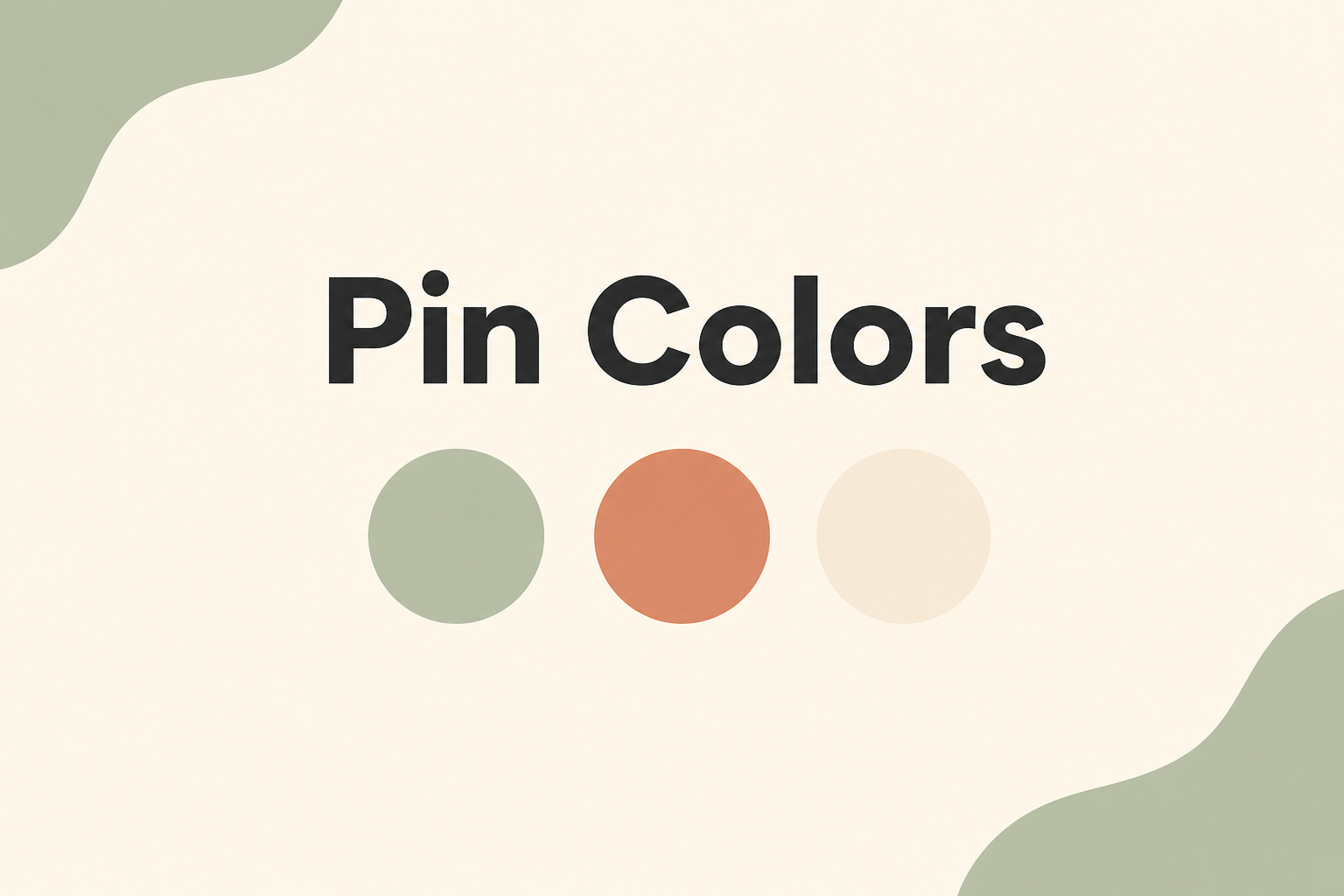
Color is the first thing users notice before they read a single word on your pin. The right palette can stop a scroll; the wrong one blends into the feed.
Warm vs. cool tones
Warm colors — reds, oranges, yellows — create urgency and appetite. They perform well for food, sales, and lifestyle content.
Cool colors — blues, greens, purples — feel calm and trustworthy. They work for finance, wellness, home decor, and educational content.
Neither is universally better. Match your palette to the emotion your content should evoke.
Contrast beats harmony in the feed
Pins with high contrast between background and text consistently outperform muted, tonal designs. A bright headline on a dark overlay, or dark text on a light band, reads instantly at thumbnail size.
Monochromatic pins can look elegant in a portfolio but often underperform in Pinterest's competitive feed.
Build a 3-color system
Pick one primary brand color, one neutral (white, cream, charcoal), and one accent for calls to action or highlights. Reuse this system across every pin so your content becomes recognizable over time.
Seasonal adjustments
You do not need to redesign everything for each season, but swapping accent colors — sage green in spring, burnt orange in fall — keeps your feed feeling current without a full rebrand.
Test one variable at a time
When experimenting with color, change only the background or accent while keeping layout and headline identical. That way you can attribute performance differences to color rather than confounding variables.
Preview color choices on real pins with the Pixlory Pinterest pin generator.
Related posts

7 Pinterest Pin Design Best Practices That Actually Get Clicks
Proven design principles for pins that stand out in the feed and earn saves, not just impressions.
5 Common Pinterest Pin Mistakes (And How to Fix Them)
The design and strategy errors that kill pin performance, with quick fixes for each one.
Why Vertical Pins Outperform Square and Horizontal Images
The data behind Pinterest's 2:3 preference and how to convert any source image to vertical format.