
Text Overlays on Pinterest Pins — What Works and What Doesn't
Font choices, placement rules, and headline formulas for pins that communicate instantly.
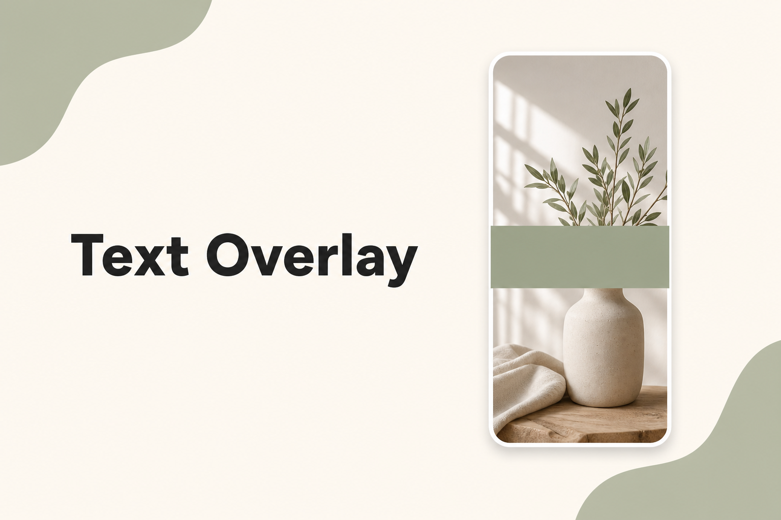
Text overlays are the most important design element on most Pinterest pins. They tell the user what they will get before they click. Done well, they boost click-through rates dramatically. Done poorly, they make your pin unreadable.
Keep headlines short
Aim for 4–8 words. "Easy 30-Minute Chicken Stir Fry" works. "Check Out This Amazing and Delicious Chicken Recipe You Will Absolutely Love" does not — it will truncate or shrink to illegibility.
Font selection
Use bold sans-serif fonts — think Montserrat, Oswald, or similar heavy weights. Avoid:
- Thin or light font weights
- Script or handwriting fonts at small sizes
- More than two font families on one pin
Placement rules
Place text where it will not cover the main subject. Common effective placements:
- Top third — above the focal image
- Bottom band — a solid color strip with text
- Center overlay — semi-transparent dark layer behind white text
Never place text over busy or detailed areas of the photo.
Headline formulas that convert
- Number + outcome: "7 Storage Hacks for Small Closets"
- How-to: "How to Make Sourdough Without a Starter"
- Time-bound: "15-Minute Weeknight Pasta"
- Problem + solution: "Tiny Kitchen? Try These Layout Tricks"
The squint test
Shrink your pin to the size of a phone thumbnail and squint. If you cannot read the headline immediately, increase font size, add contrast, or shorten the text.
Test headline readability using the Pixlory Pinterest pin generator before you publish.
Related posts
The Complete Guide to Pinterest Pin Templates
How to build reusable templates that keep your feed cohesive and cut design time in half.
Color Psychology for Pinterest Pins That Convert
Which colors grab attention in the feed, how to build a palette, and when to break the rules.
7 Pinterest Pin Design Best Practices That Actually Get Clicks
Proven design principles for pins that stand out in the feed and earn saves, not just impressions.